Dynamic Lighting

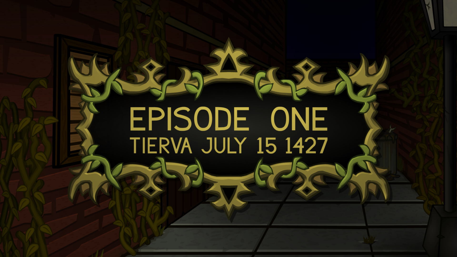
The animated World’s End title shown at the end of our trailer is another one of the finishing touches we’ve applied to our artwork. We added interactive dynamic lighting to enhance the game’s title in the main menu, and it was such an improvement we decided to embrace the effect and apply it to the official title. The more colorful, higher contrast look should help our poster stand out from the crowd.

Producing the effect starts with a flattened version of the original, hand-drawn graphics. I took the opportunity to fix some inconsistencies in the (also) hand-drawn font that were bothering me as I had been spending time scrutinizing our use of fonts elsewhere in the game.

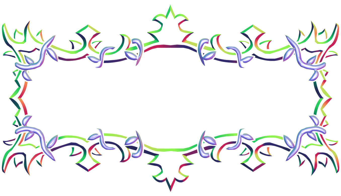
The illusion of depth is achieved by applying a surface normal map to the flat artwork in a process known as bump mapping . Normal vectors represent the direction our virtual surface is facing on a pixel-by-pixel basis using the three color channels of an image, and look rather psychedelic.

Then, we can place virtual light sources around the artwork and animate them to follow the mouse pointer (in the main menu), or following a predefined path as shown in the Episode 1 title above. The result is a dramatic improvement.

2024.Sep.13
Feedback is welcome on Patreon
Thank you for your support!
