Iconography

Another area in need of finishing touches in World’s End was the icon set. Our icons were roughly identical in size and approximately centered around a common center point, but even before going full screen, there were consistency issues showing up in places – especially the item menu. So, this particular round of polish has been nagging at me now for multiple chapters, and is satisfying to finish.
Normalization

We sized our icons to a guide, and applied some scaling to fill the available area to achieve similar visual weights. Now they can be used consistently – scaled relative to the size of accompanying text whether in titles, menu items and elsewhere.
Style

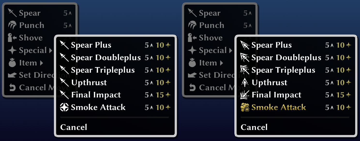
Icons previously had built-in drop shadows, and some instances of two-tone artwork that never worked well with our beveled hover and skill learned styles – shown here with the before and after of the “choking” icon. We switched to a monochromatic, stencil-like treatment first used by none other than the venerable mute button.

Action Menus

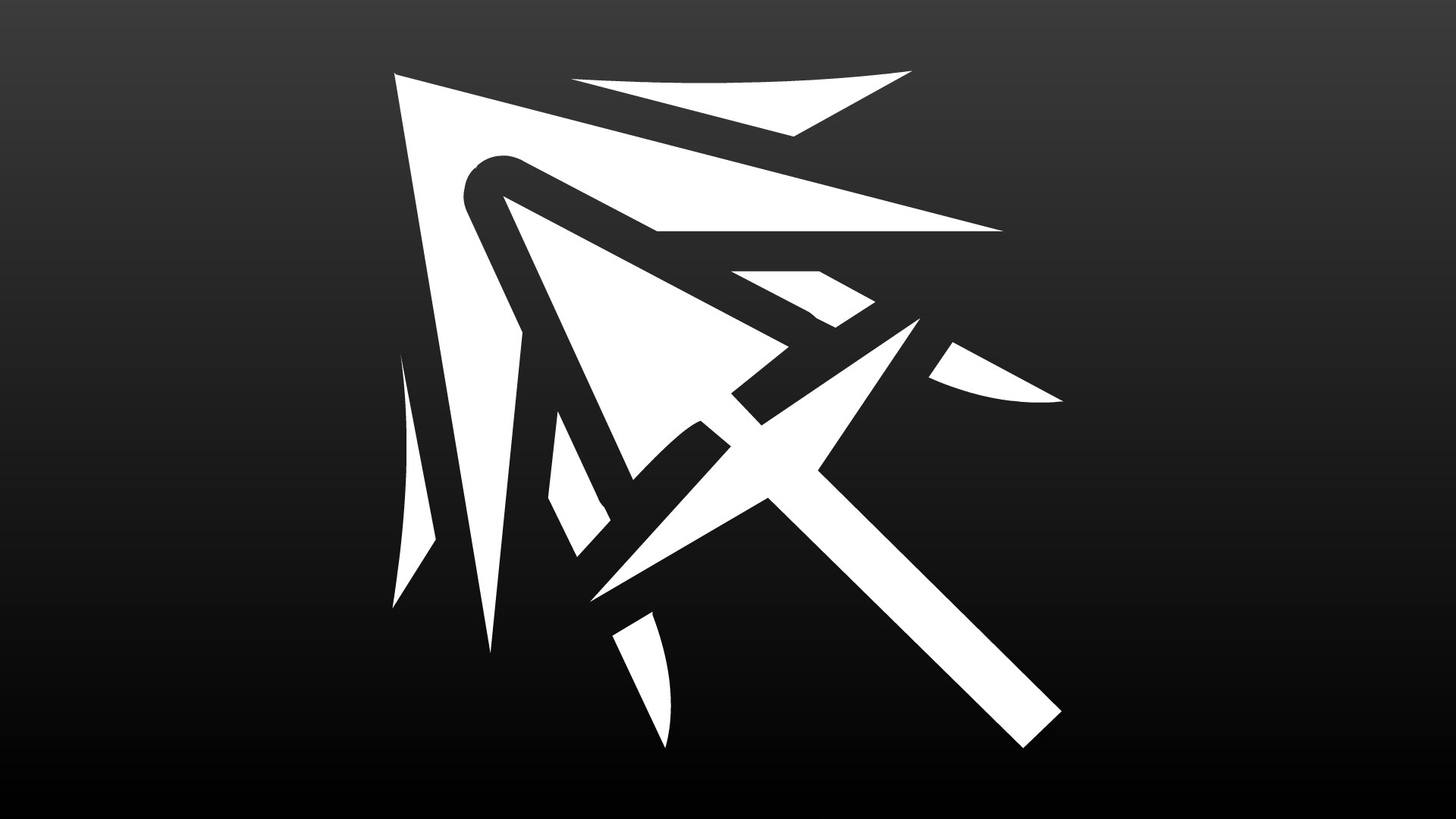
Since we’ve now finally, fully embraced icon usage and added them to the action menu, the need for more variety became apparent. The further Ivan skills up, for example, the longer his special attack menu’s list of spears would rather unclimactically grow.
Video Shorts
In other news, we’ve been producing short-form videos for sharing purposes. Give it a try!
YouTube X Facebook Instagram TikTok
Thanks for your support as always!
2024.Nov.22
Feedback is welcome on Patreon
Thank you for your support!
