All The Screens
What started out as a review of every menu in the game for usability on phones snowballed into basically finishing the rest of the interface programming. While I’m not completely done with this work, I should remove my nose from the grindstone with a long overdue update.
Touchscreens

The first step in supporting phone-sized screens was making all buttons about 50% larger to make them tappable. Sometimes this necessitated moving things around to make space, and a few menus will still need adjustment to support notched displays and stay out of safe areas, etc.
Scrolling areas can now be swiped to scroll, and although I originally put adding momentum on our nice-to-have list, I quickly realized that such behavior is expected and added it in.
In-Game Screens
Reviewing every menu for touch compatibility was the first scrutiny I had given much of the user interface since adding finishing touches in our failed attempt to find a sponsor for Chapter 1. Since I had to re-learn the long untouched code behind most of these menus, I decided to make some improvements while I was at it.
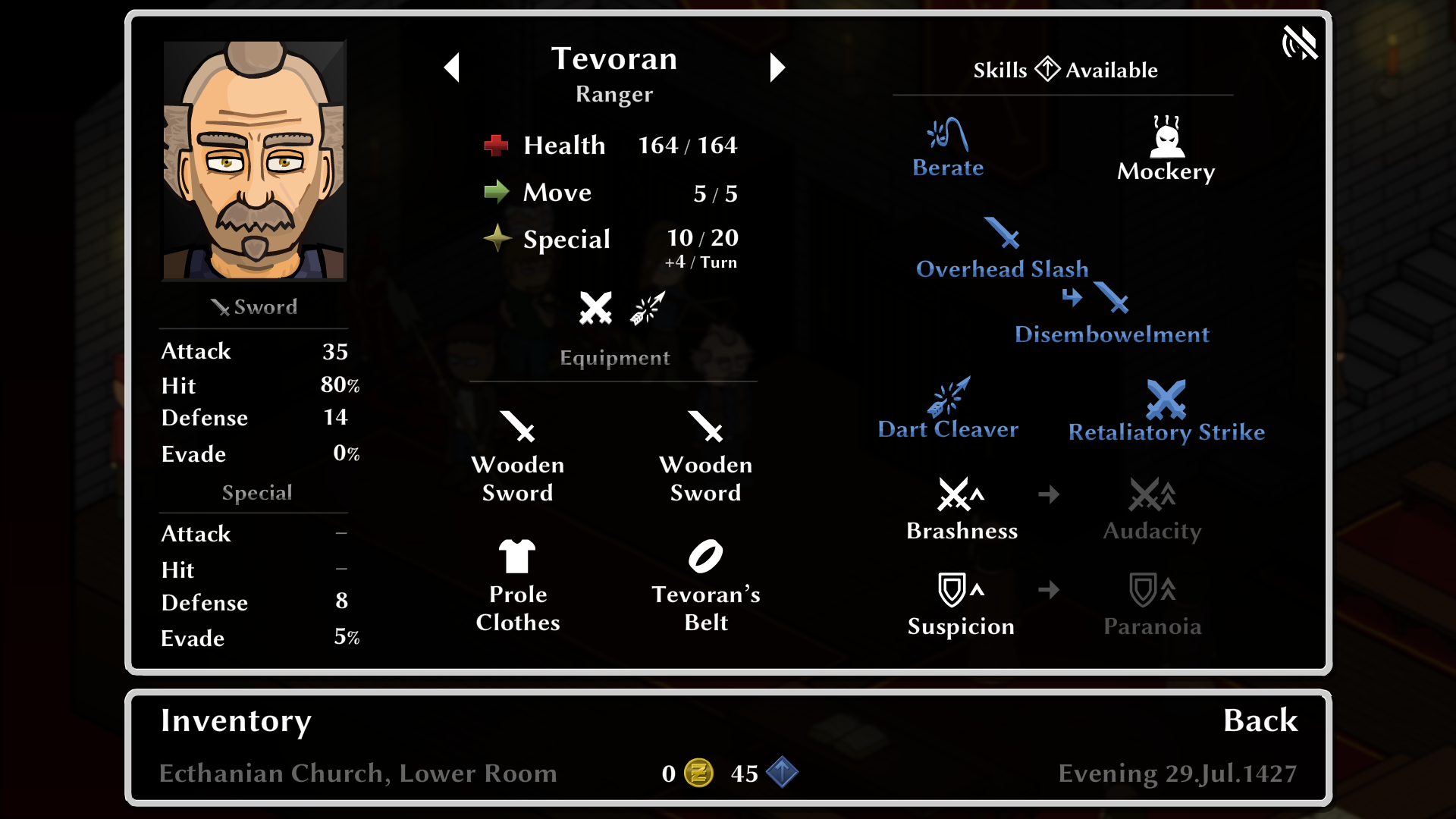
I gave some attention to my more amateurish layouts and other sloppiness made more noticeable when filling the screen, and upgraded some of the less professional looking screens. For example, the save menu now has more than three manual save slots, and the skill and equipment lists are no longer basic lists.
The Grid
I also applied some finesse to the grid. The way grid tiles overlap was never great looking, and is another issue worsened by scaling everything up to fill the screen.
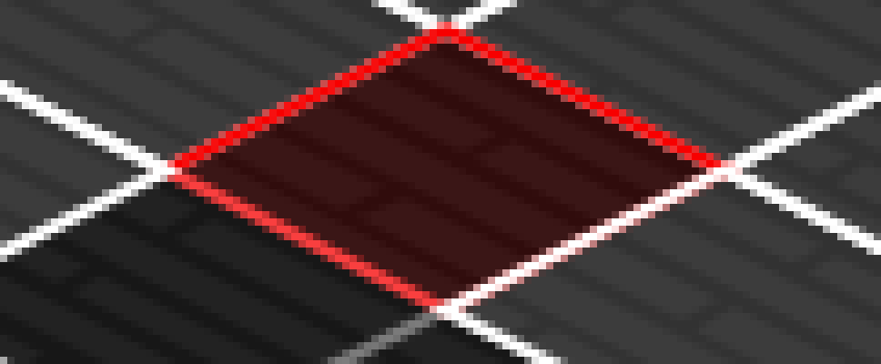
I changed the way depth sorting works to reorder selected (red) tiles over selectable (white) and disabled (gray) ones when possible. This is limited by a drawback to the modified painter’s algorithm we use to stack map layers, units and grid tiles from back to front, so it doesn’t always work but is significantly better looking when it does.
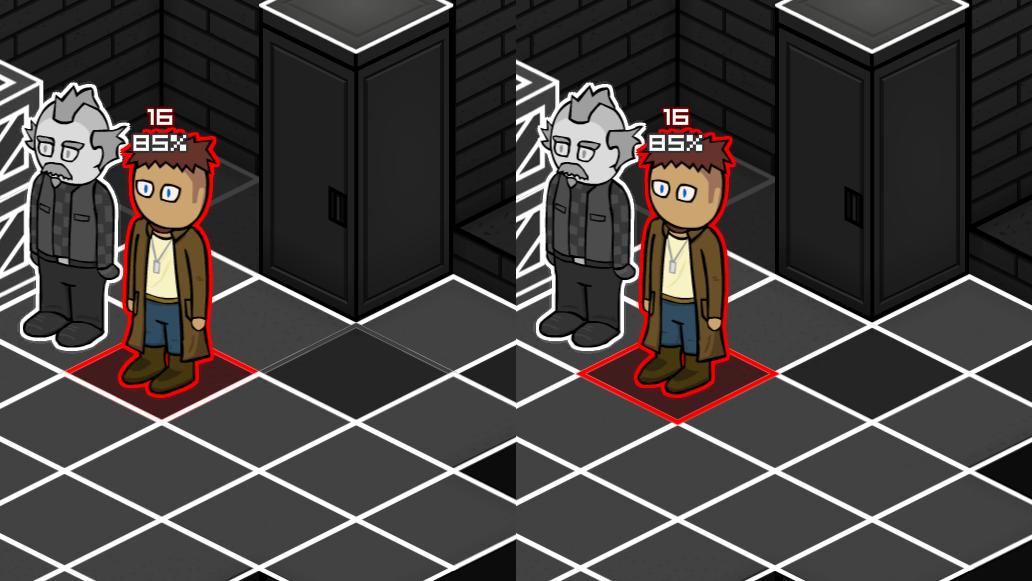
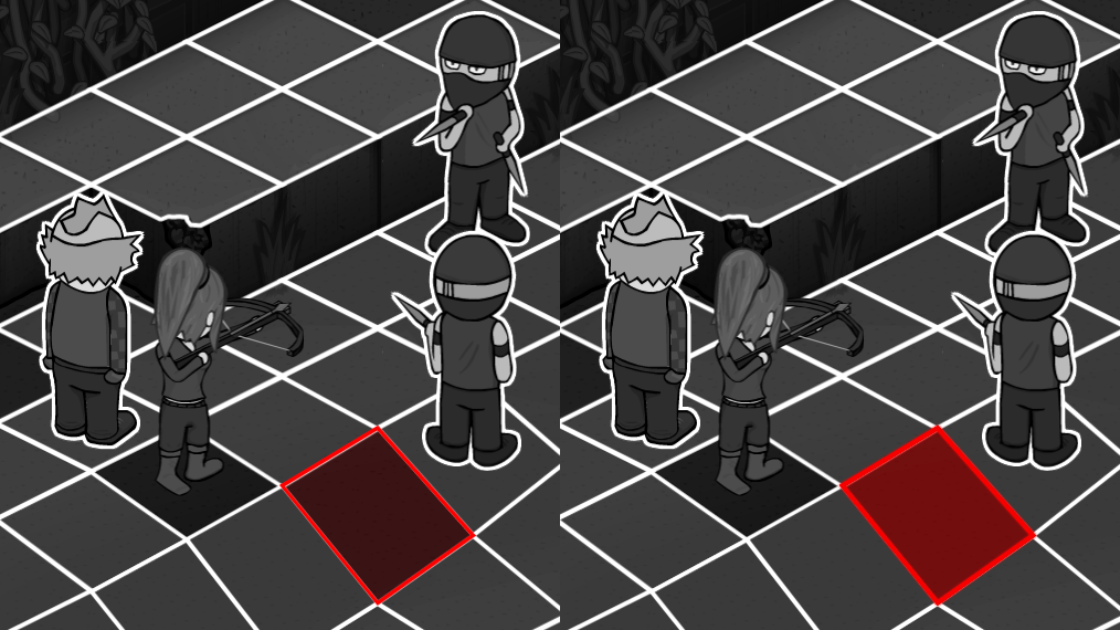
The hairline thick portions of overlapped tiles that are visible when tiles aren’t perfectly aligned is another nuisance that got worse. I’m now applying a slight red glow to selected tiles to mostly obscure this. It’s somewhat counterproductive because it increases the amount of overlap when the depth sorting improvement can’t be applied, but I think it’s an improvement overall.
Other News
I managed to try running World’s End briefly on some new hardware and am happy to report that we are compatible with both high framerate displays (at multiples of 30 FPS, tested at 120) and the Steam Deck, in initial tests at least.
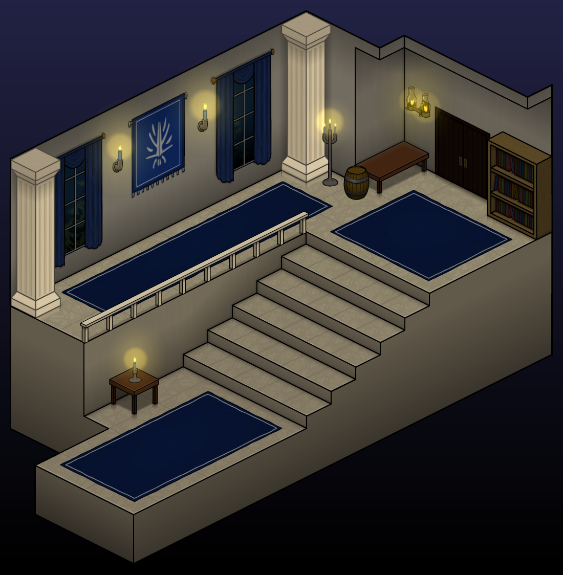
Playtesting Chapter 4 and the (sometimes literal) polishing up of old maps continues, and we will have updates in those areas soon.
Thank you for your support, everyone!
2022.Oct.03
Feedback is welcome on Patreon
Thank you for your support!
